Travel Desk Management
Web design and development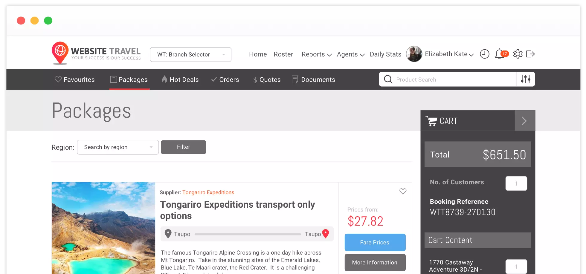
Project overview The challenge
The travel desk management system is a booking software developed by Website Travel. It was specifically built to manage the travel agency industry. It is feature packed with tools that help with the day-to-day activities of a travel business, it is essentially a one stop solution for your travel industry needs.
The problem with TDMS was that it became a dated product, the technology is great but was frustrating to use and the original user interface was non-existent and was just not very nice to interact with. So, a redesign and audit of the entire user experience and system had to be done in order for the product to be modern and be able to compete in the existing market.
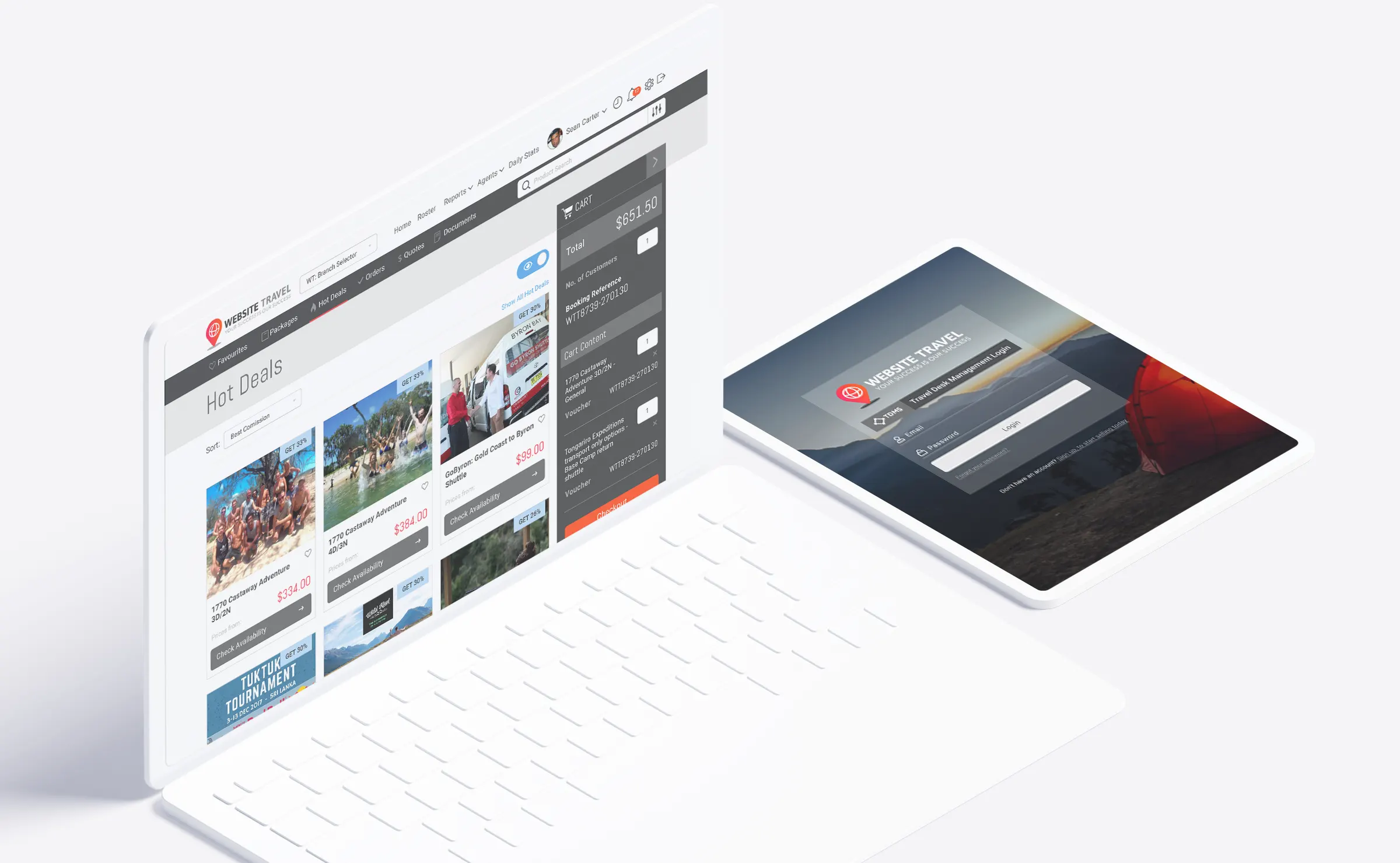
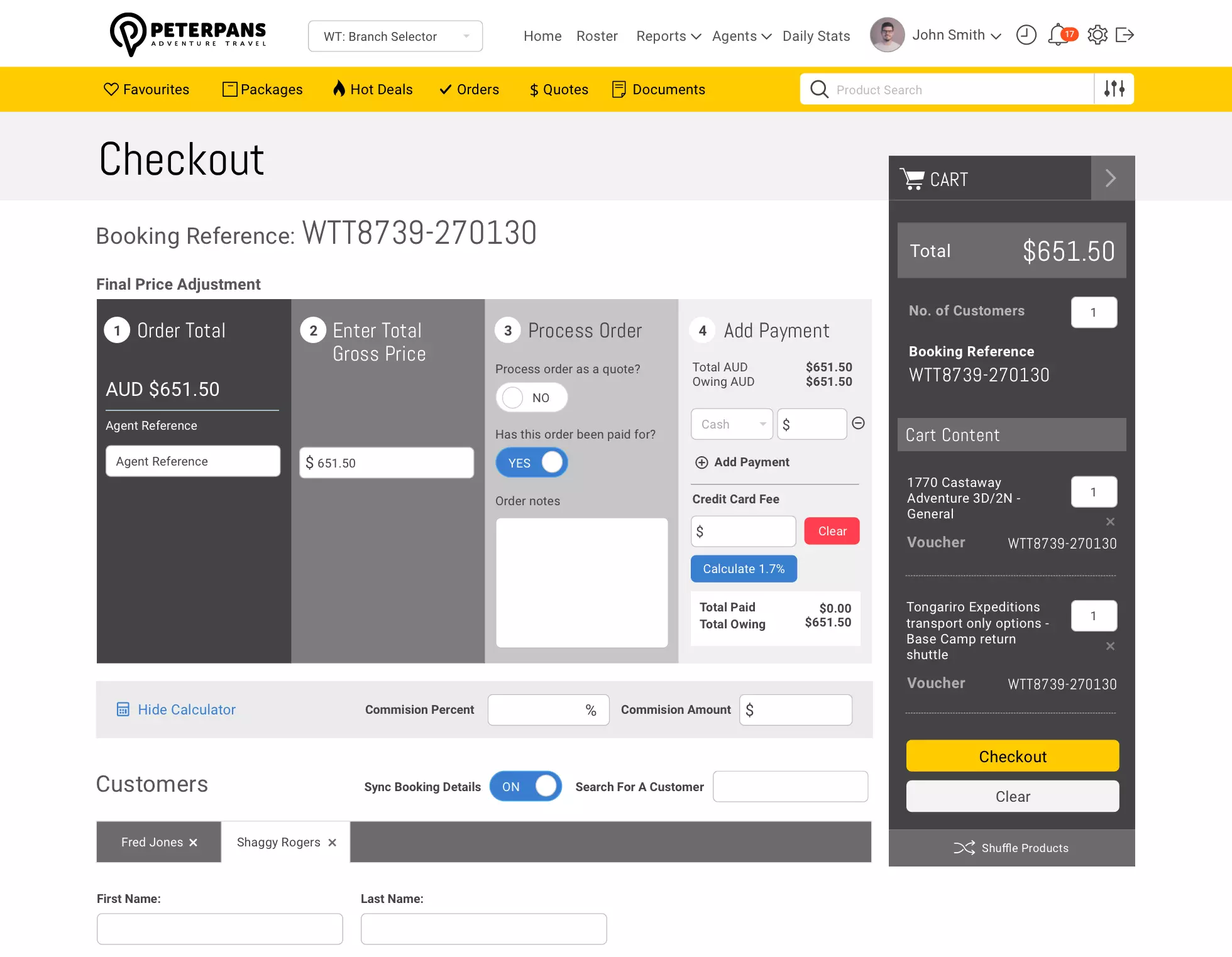
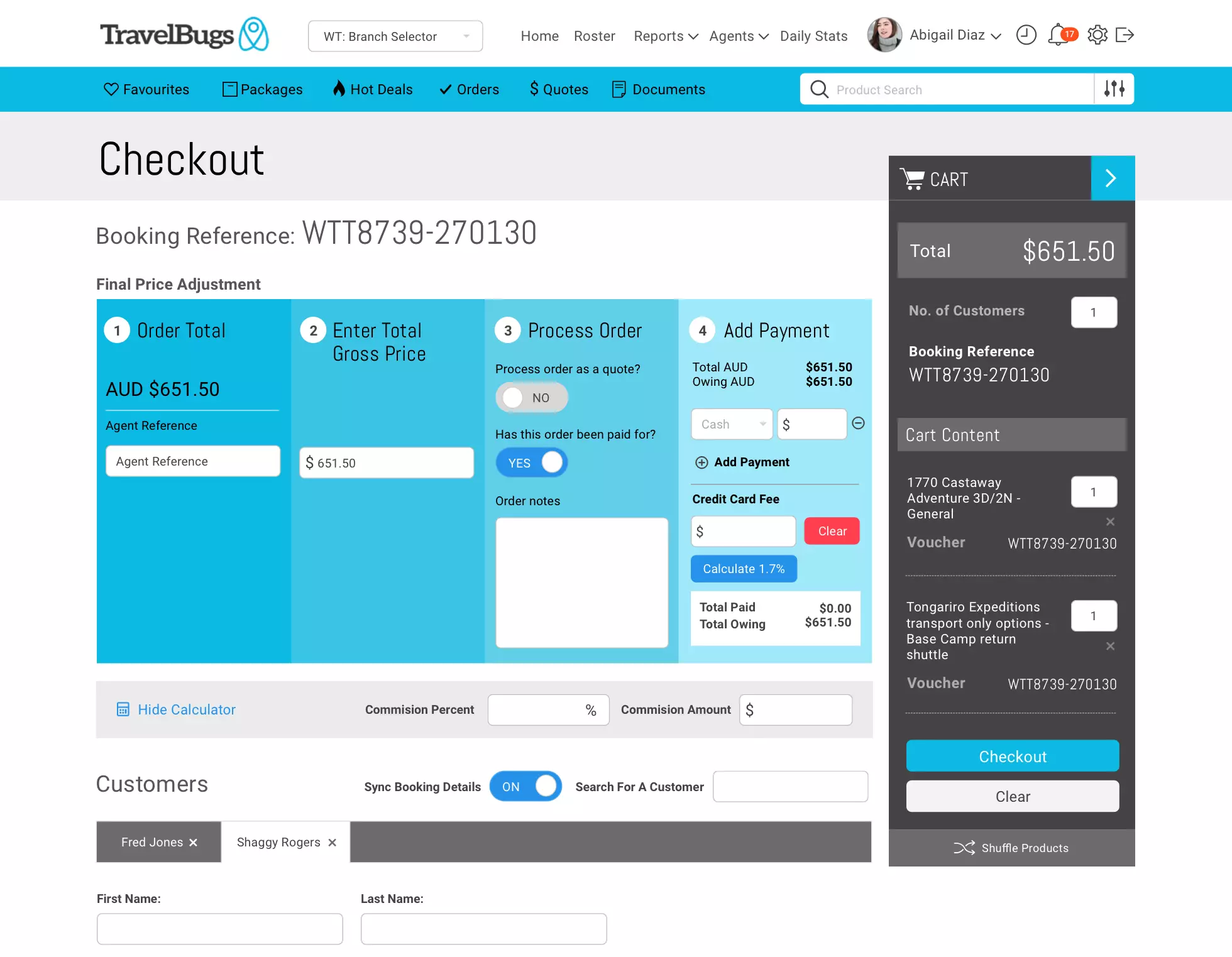
As well as an overhaul of the user interface, another requirement was to have the ability to apply different themes to allow personalisation for each business / store using the system, so this had to be taken into consideration when re-doing the designs.
The solution
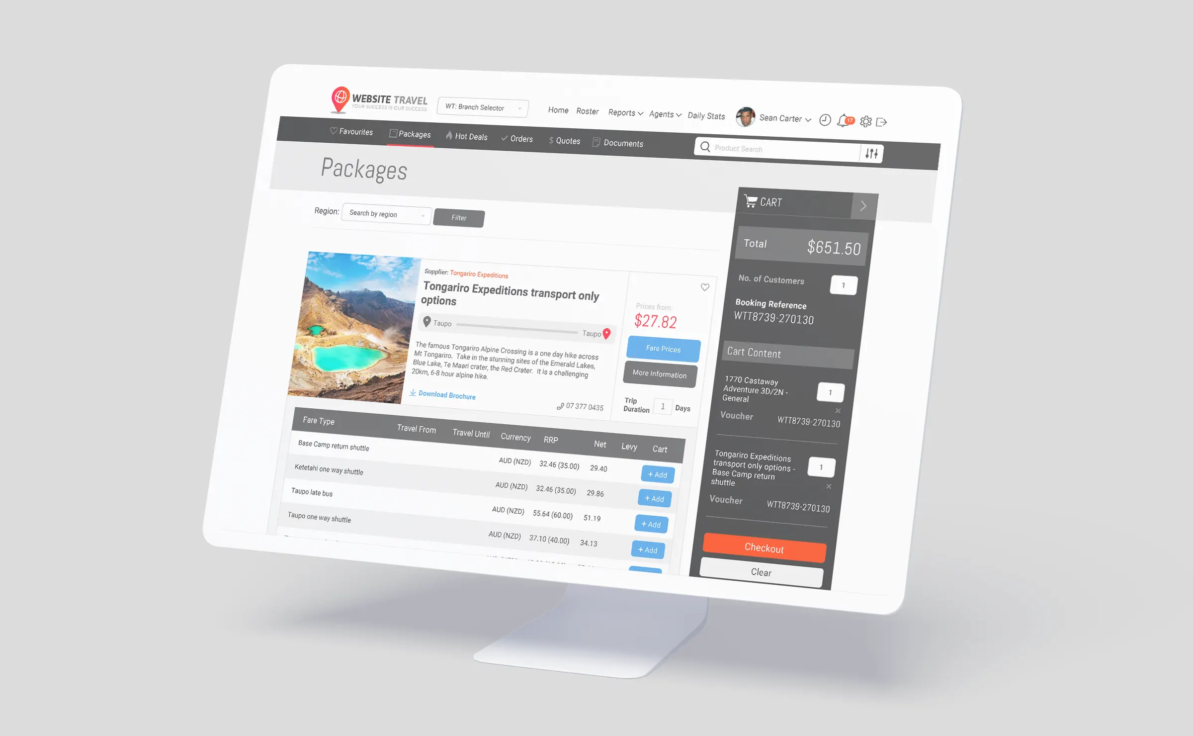
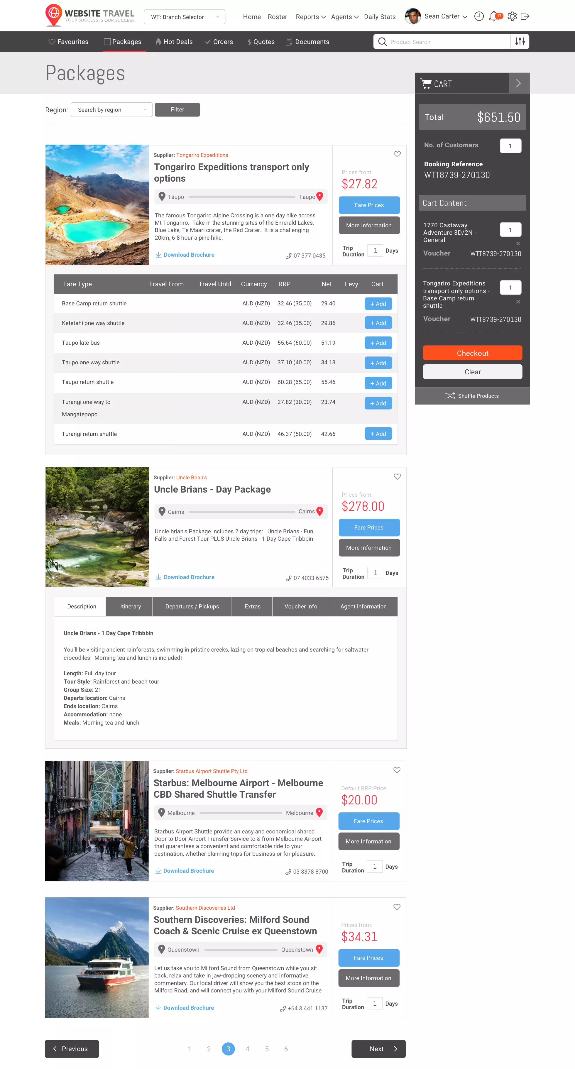
The first improvement was to look at the user flow and figure out the pain points of the system, I looked at common tasks such as booking products and improved that by considering the use of icons and symbols to help portray the important information when viewing products.
For example, emphasis was placed on the start and end of a trip, along with the inclusion and price in the way of symbols and font-hierarchy.
In doing this, it helps tour operators and agents know the important aspects of the product without having to go into the product page itself. This makes comparing similar products easier as the booking agent won’t need to leave the page and risk losing the product query result, thus saving time and improving booking success with the customer.
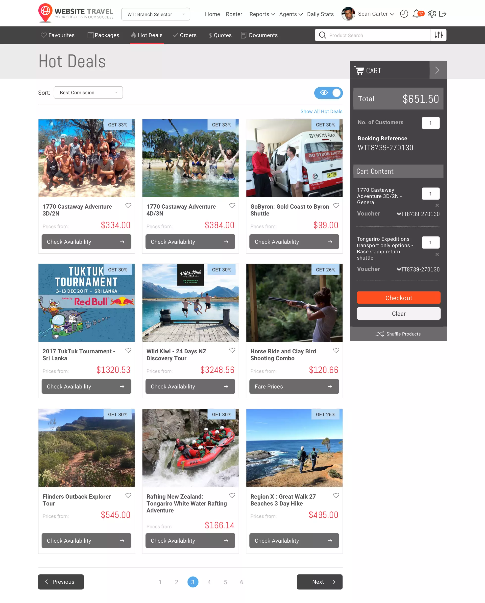
The whole checkout process was also looked at and improved, simple re-arrangement and re-design of the elements and buttons made it more user friendly and nicer to use. It’s now easier to see cart content, adjust commissions and checkout / whereas before it was hard to see or distinguish what products were in the cart or determine if you were in the checkout and payments area of the system.
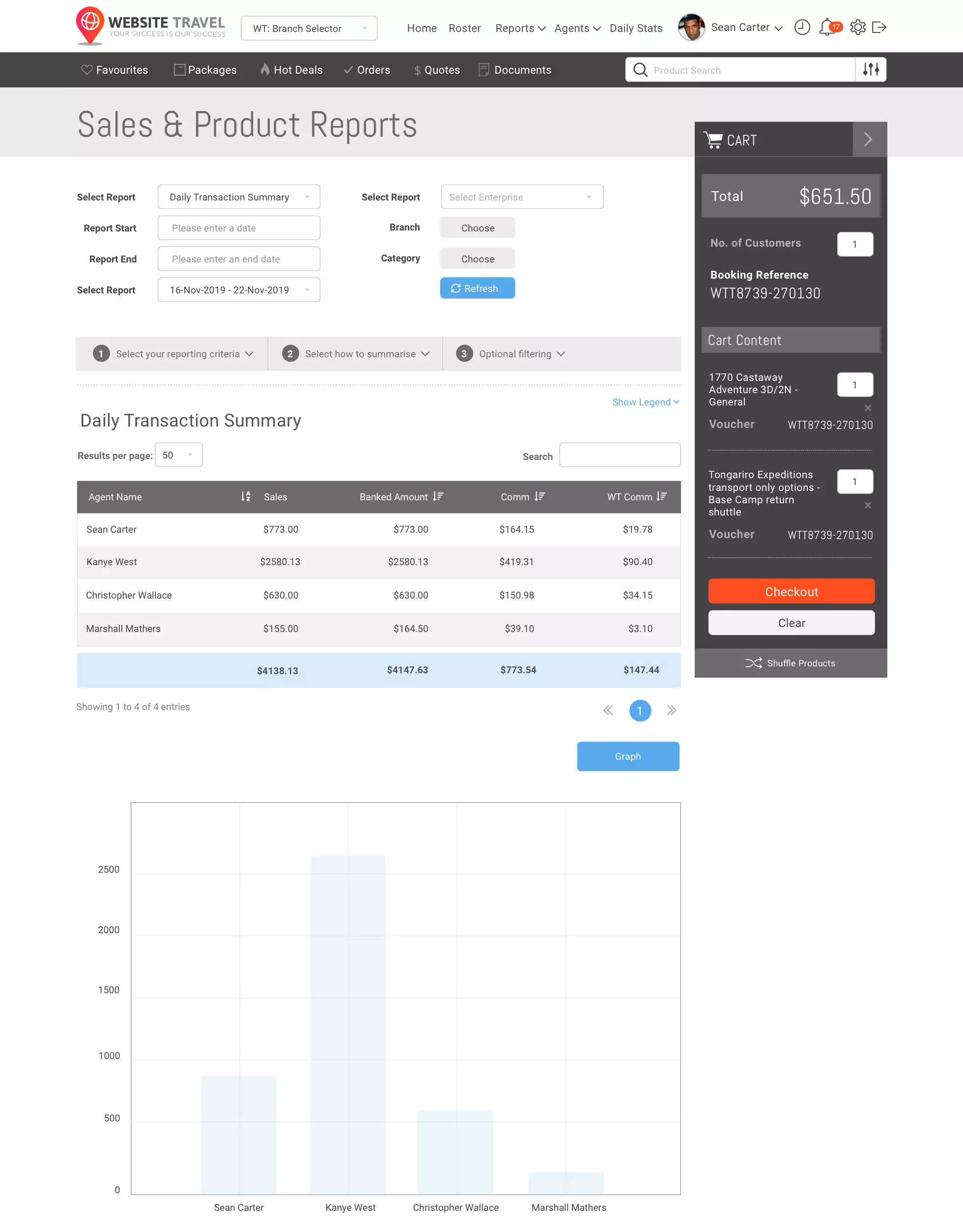
Other areas and tools of the software was also looked at and consolidated, as we tested and improved the information architecture and logically moved items, so they are easier to find based on user testing and feedback.
With easy direct access to our users and persona groups, we were able to validate design ideas faster, as we were able to get valuable design feedback which allowed us to apply a lean UX approach and continue to improve the product via a constant iterative process during the design and build phase.
Overall, the redesign and improvement of the system’s user flow and user interface has helped modernise and make TDMS a leading travel industry product. This project was undertaken during my time with Website Travel.
Responsibilities Task involved
- Requirements gathering
- Wireframing
- Wireframe design testing
- User interface design
- Front end development
- User and device testing